Website improvement
Description
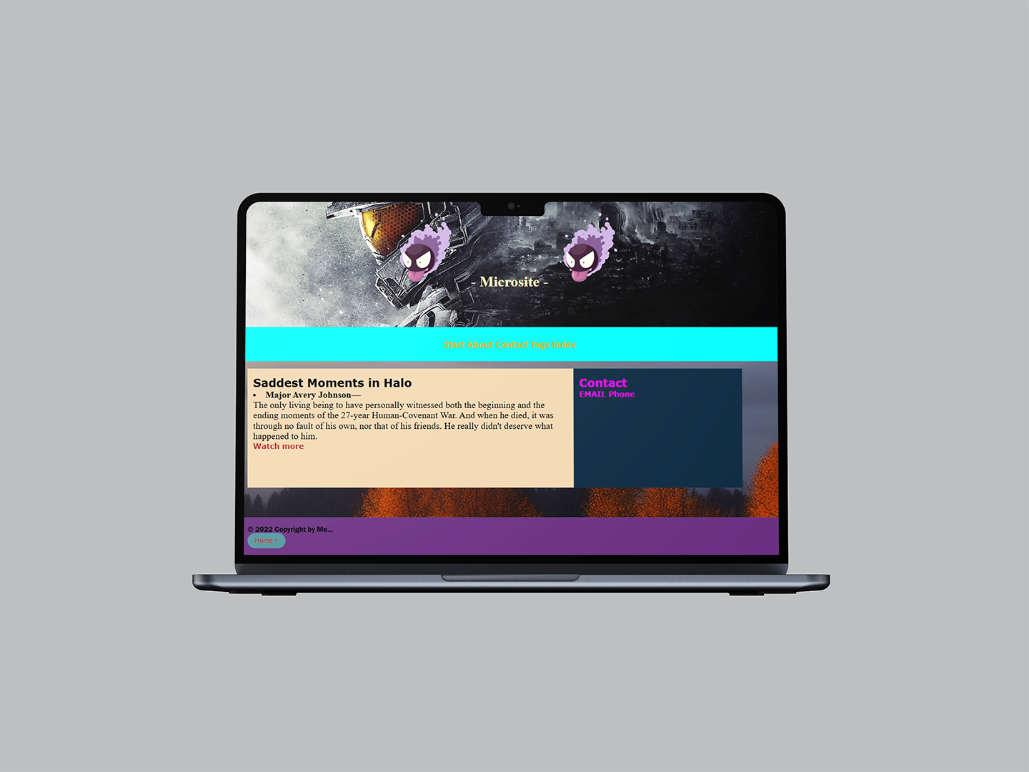
For this website, I wanted to create a personal, melancholic corner where gamers can reflect on the sad moments of the Halo franchise. I decided to focus on the story of Halo, starting from the beginning—before Master Chief, the main character—up until the latest game. I cover the saddest deaths from the series, specifically those of characters who left a lasting impact on us
Feedback
The feedback was quick, short, and simple. The background cover was the best part of the entire initial website. Recreating a website from scratch would take a lot of time, though.
Changes
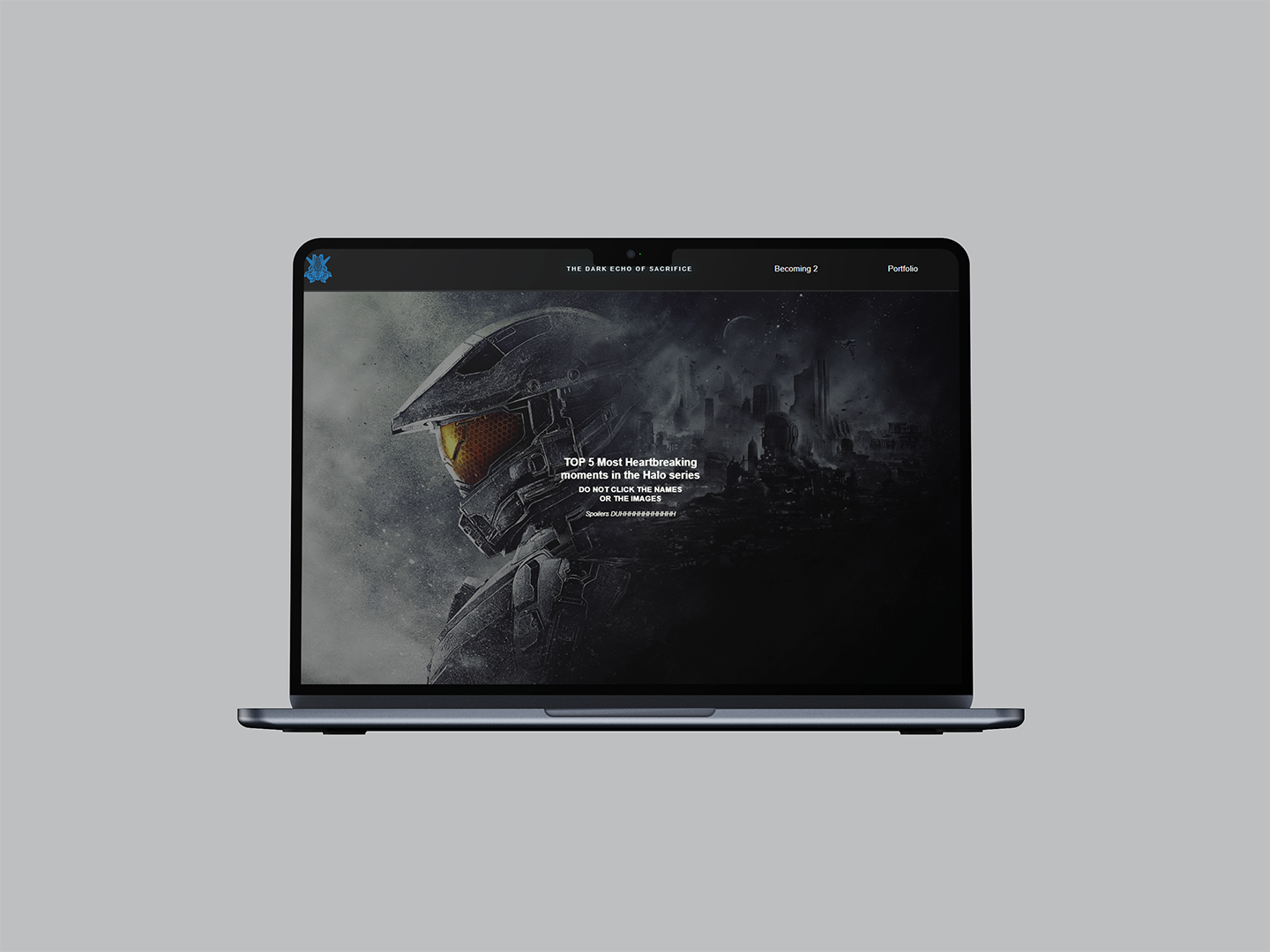
I basically created a whole new website. Now that I have more knowledge and tools, I can create a different website—one that's closer to what I originally envisioned. I changed the navbar and added sections for each character. I also incorporated animations that activate as the reader scrolls, while ensuring the website is fully responsive.
Print Improvement
OLD DESIGN PRINT
NEW DESIGN PRINT
Description
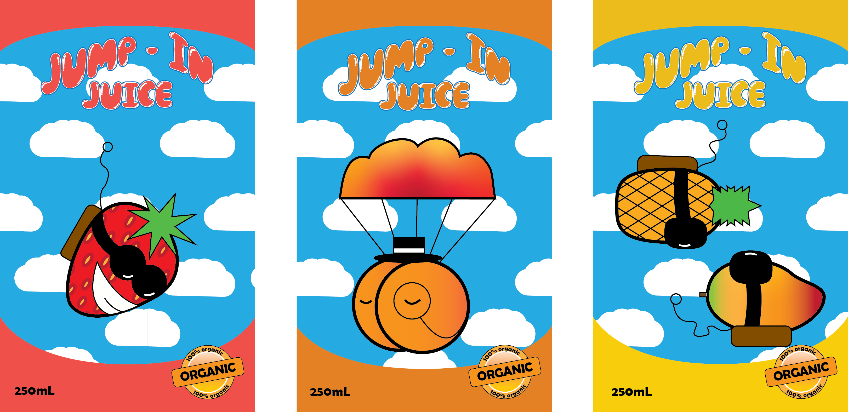
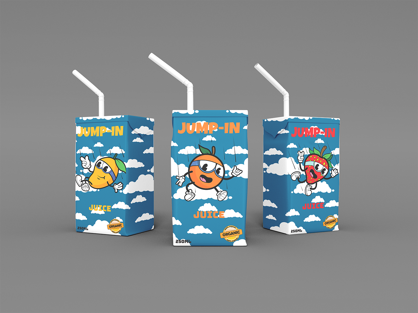
For this project, we were asked to create some graphics for a tetra pack juice box. Basically we had to choose from the graphics for the fruits, to the background and the font. Initially there were some names for the project, but I decided to pitch in my idea to call my project Jump-In Juice. Which I am happy it was accepted. The main idea behind the name was to create some fruits free falling.
Feedback
This is the feedback I received: The fruits could be more appealing or fun—try adding extremities to make them feel like they’re actually falling. Keeping the background is a good idea, but consider tweaking it so the clouds don’t look just painted—after all, no two clouds are the same.
The font is too bubbly; maybe try something simpler but still eye-catching. Also, consider avoiding the arc in the text, as it makes it harder to read.
Changes
I mainly changed the look of the fruits, the background, and the font. I wanted to give the fruits a more cartoonish style, so I added arms and legs, changed their glasses, and tweaked their expressions. I was inspired by Cuphead when creating this new version of Jump-In Juice. Looking back, my original idea wasn't bad, but it felt a bit too simple and lazy.
For the background, I stuck with the cloud idea—since, after all, these are fruits falling from the sky. As for the font, I originally wanted something that would attract kids, but I realized they probably don't even pay much attention to the text. They're more into fun, wacky graphics and silly fruit characters. So, instead of the bubbly font I started with, I went for something simpler but still eye-catching.